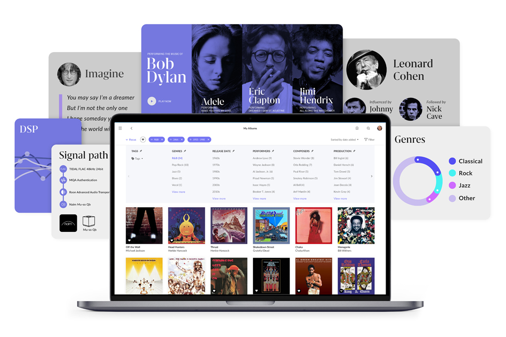
Roon Labs has announced a complete re-imagination of its leading streaming software with significant changes in graphic design layout, enhanced music discovery possibilities and a more personalised user experience.
Version 1.8 is Roon’s most comprehensive update, bringing a host of new features and a sophisticated layout with profound levels of data, improved design layout and much more. Roon’s feature-enhanced Valence suggestion algorithms are said to be far more accurate in terms of matching music suggestions to listener tastes.
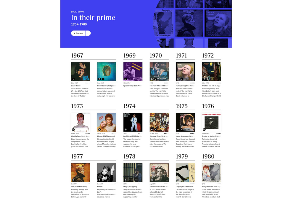
A new ‘gallery’ style music-navigating aspect has been introduced which now scrolls vertically as you would a website page. The vertical scroll is consistent across all devices, from desktop to smartphone to tablet. It’s an up-to-date interface that sees new fonts and graphics right from the ‘Home’ page to all other page and browsing locations.
Roon 1.8 has also capitalised on experience gathered through thousands of expert listeners in the Roon community to enhance metadata, therefore improving music suggestions that are said to be “tailored to each individual listener.” Powered by what Roon Labs calls Valence, this renewed accuracy in music suggestions is further extended by Roon’s direct connectivity to Tidal and Qobuz (soon-to-be-available in Australia) high-resolution streaming services. Roon’s improved Focus feature now expands to also include Tidal and Qobuz in addition to the user’s own local music library. Roon’s algorithms can cross-reference composers, artists and producers to determine suitable suggestions. Next, it considers your own listening history to then filter popular results from genre “experts”.
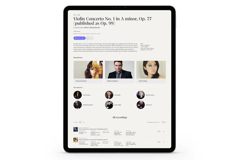
Further enhancement is provided via a new ‘Discography’ feature which offers browsing and filtering of a favourite artist’s best-loved albums, or artist collaborations, etc. Here, Valence can search through and intelligently hone-in, for example, on a data search based on a favourite performer or conductor of Beethoven’s compositions. Valence then searches its deep data banks for the criteria taking into account historical period, music collaborations, instrumentation and much more. Classical music also now gets a smart new layout style which is tied-in with Valence as described above.
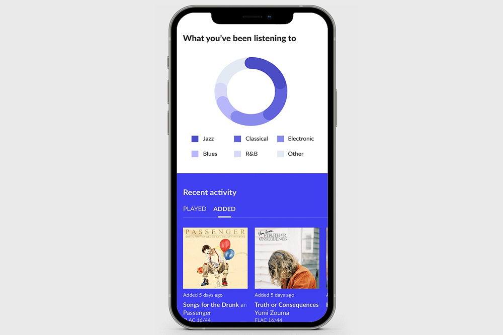
Coming back to listening history, Roon 1.8’s Home page will now include a user habits ‘Recent Listening’ calendar-style graphic depicting playback history based on a number of period options (weekly, monthly, yearly or always ongoing). Further, the ‘What You’ve Been Listening To’ page will display most listened artists and album titles, etc. Artists recently selected but which aren’t part of a most listened list will also be display with direct links and photo graphics. A direct link to the massive Roon Labs community can be accessed from most locations allowing direct user experience input and connectivity.
Roon Labs told SoundStage! Australia, “Roon now has a fresh new visual design that takes its inspiration from the idea of the museum – an airy, neutral environment in which to display things of beauty. We also took cues from classic music magazines, using bold typography and innovative layout to bring music to life.”
Roon Labs 1.8 will begin roll-out from February 9 2021.
Roon Labs 1.8
Price: Free with Roon Subscription
www.roonlabs.com


